Cascadas Restaurant
Industry
Hospitality
Client
Cascadas
Year
2026
Services
Logo & Visual Identity
About The Brand
Cascadas is an Italian restaurant in the heart of Sunny Beach, set within the gated Cascadas Family Resort - a place of lush greenery, pools, and a calm Mediterranean rhythm.
The cuisine is Italian and the atmosphere is warm and quietly refined. Evenings move slowly here, where the garden and the sea blur into one. Cascadas is an invitation to slow down and savour the moment - through taste, light, and stillness.
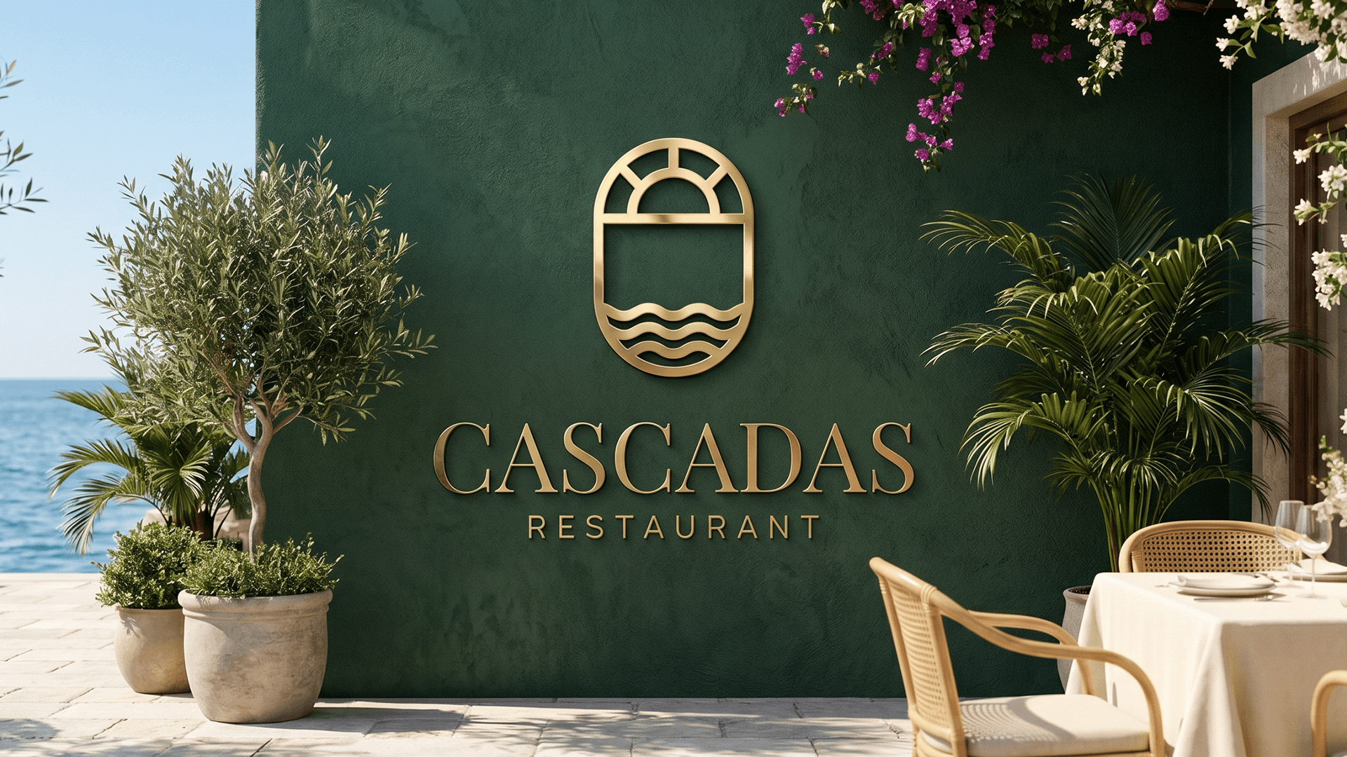
Cascadas - where the sun meets the sea.
Problem
A strong location and a clear character, but no established visual identity. The brand had no way to stand apart from the typical seaside venues - there was no defined colour direction, no typographic consistency, and no distinctive symbol to convey its sense of quiet luxury.
Solution
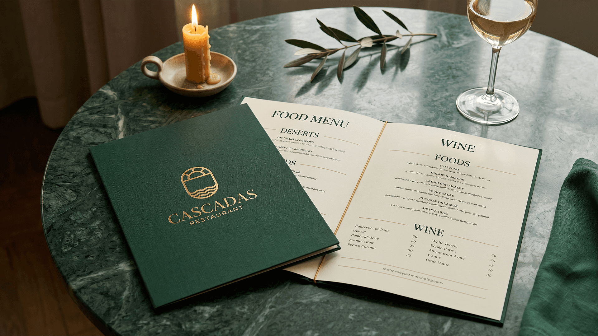
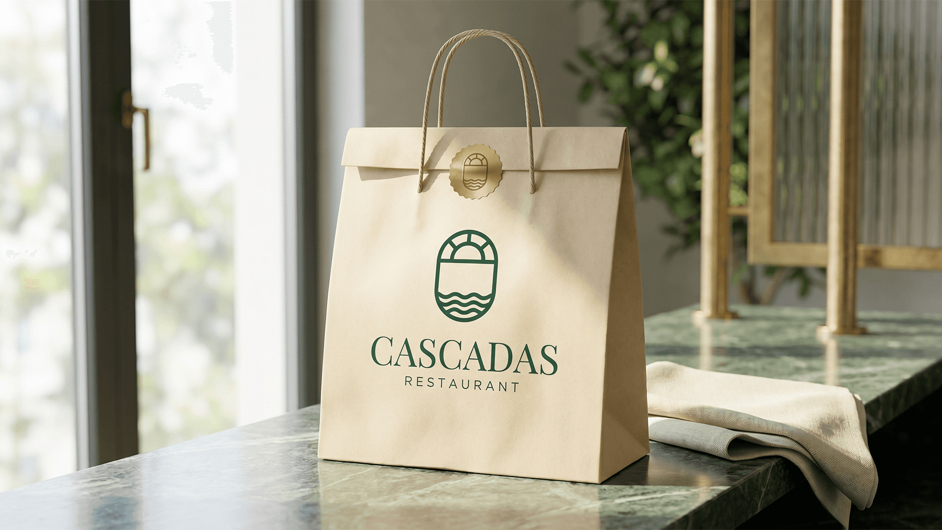
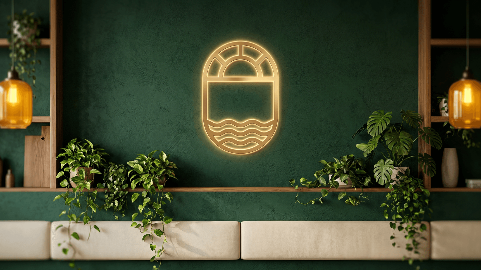
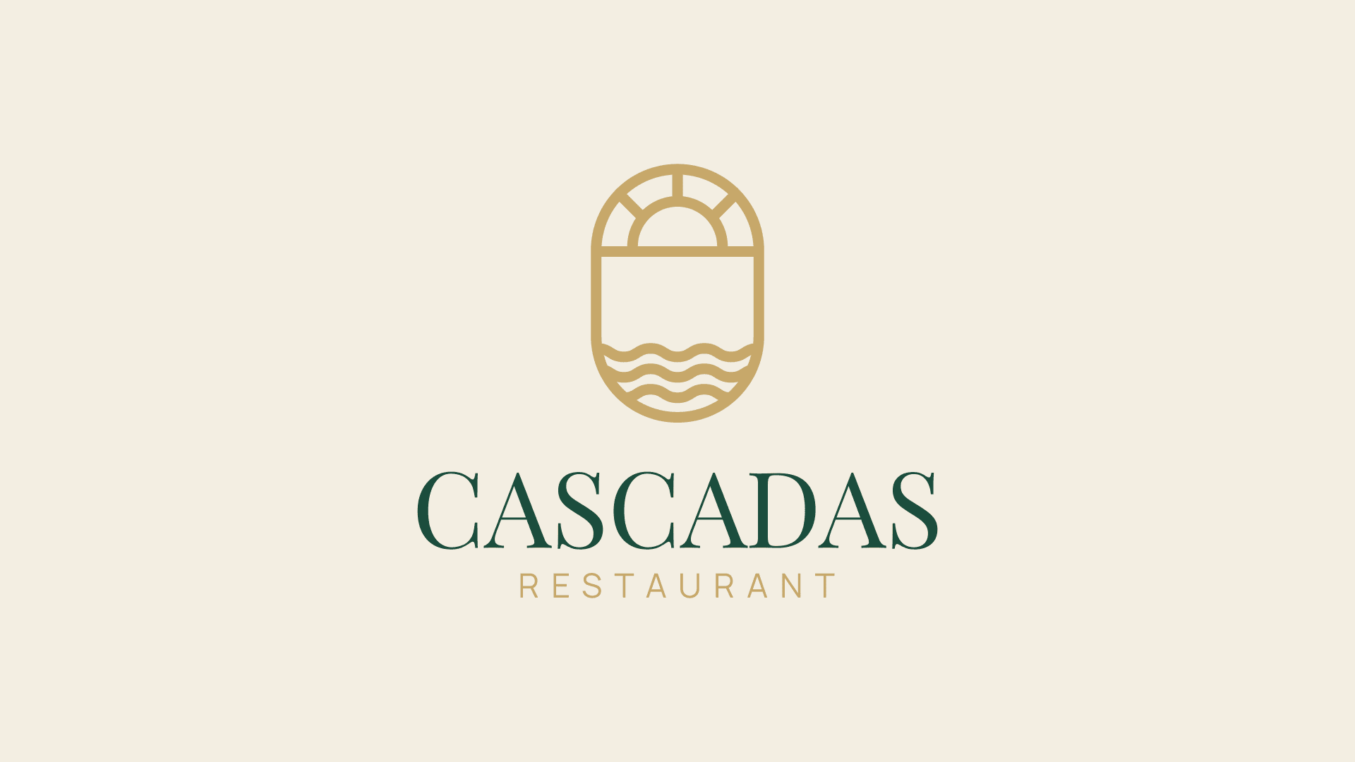
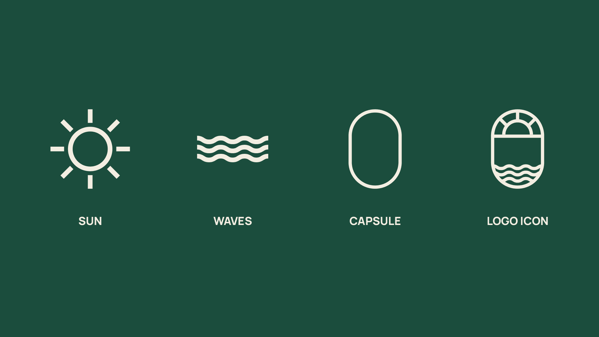
I built a complete identity around a single idea - the moment the sun meets the sea. The symbol brings together a rising sun and calm waves within a soft capsule form that reads both as an arch and as a window to the sea.
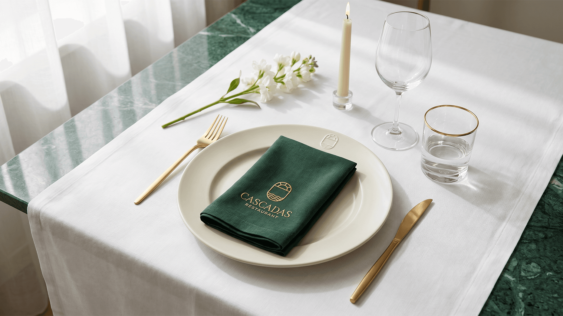
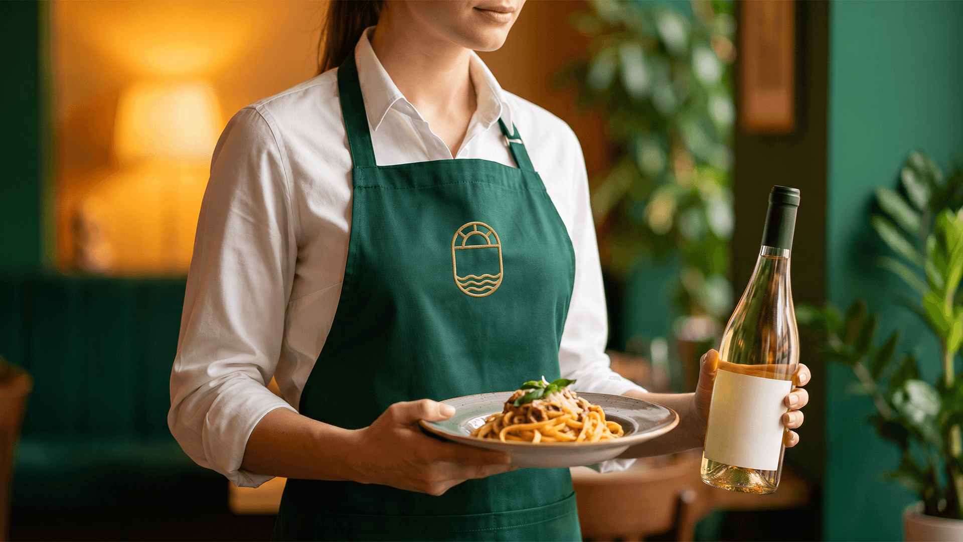
The palette rests on Forest Emerald and Brass Gold, balanced by Cream and Espresso - the green of the garden and the warmth of the sunset. The typography pairs Playfair Display for editorial elegance with Manrope for clean, modern legibility - both supporting Cyrillic. The result is a calm, refined brand, recognisable from the sign at the entrance to the wax seal on a card.
Logo Concept
The Cascadas symbol is born from a single moment - when the sun touches the water. Three elements shape it: a rising sun, calm waves, and a capsule form that holds them together, working at once as an arch and as a window to the sea. The mark is built on a precise grid for optical balance and flawless scalability - equally legible as a wax seal, an embroidery, or a brass sign at the door.


Colors
The palette is drawn directly from the place. Forest Emerald carries the green of the garden and serves as the brand's core, recognisable colour. Brass Gold adds warmth and a premium feel - the glow of the sunset over the water. Cream is the light and the linen, the calm backdrop that lets everything breathe, while Espresso brings the depth and contrast that ground the system.

Typography
The system is built on two typefaces with complementary characters. Playfair Display carries the brand's editorial elegance - high contrast and refinement in the name and headlines. Manrope balances it with clean, modern geometry that stays legible at small sizes and in digital settings. Both support Cyrillic and Latin - a deliberate choice that lets Cascadas speak freely to international guests and Bulgarian ones alike.